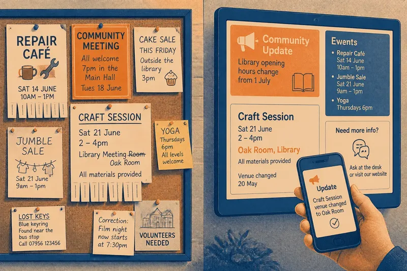
The Looping Screen Does Not Tell the Whole Story
Learn how to improve looping screen messages by matching their wording, timing and sequence to the decisions local viewers need to make.
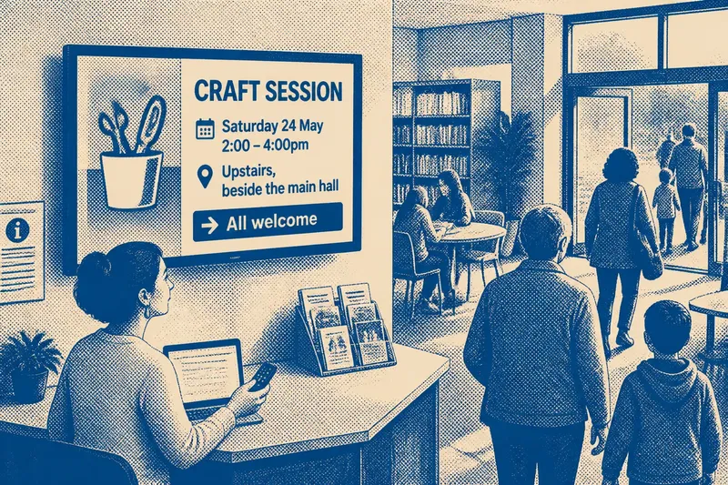
A looping screen can show the same notice all afternoon without helping anyone act on it. For a looping screen in a library, community centre or local shop, the challenge is not simply to display a message: it is to make each appearance useful to someone who joins the loop at an arbitrary moment.
That makes sequence, wording and relevance more useful places to start than repeating a notice more often. A message may arrive before its context, compete with unrelated announcements or return after its details have changed. Each problem calls for a different adjustment.
Give each slide one clear job
A slide works best when it helps a viewer make one decision: attend an event, find a service, notice a change or ask someone for help. If it tries to promote several activities at once, viewers must work out which detail matters to them before they can decide what to do.
Put the decision-making information in a clear order. An event notice might lead with the activity, then give the date, venue and a simple next action. Extra background can go on a leaflet, a noticeboard or a web page, provided the screen still contains the details someone needs immediately.
Check that the wording makes sense without knowledge of local shorthand. A room label familiar to regular visitors may leave a newcomer uncertain, and an acronym may mean little outside the organising group. Use plain names and enough context to identify the place or service.
Make a loop understandable from any point
People rarely arrive at the beginning of a playlist, so a sequence should not require viewers to remember an earlier slide. Avoid splitting a single announcement across multiple screens unless each part can stand on its own. If a sequence is necessary, repeat the essential context on every slide.
Group notices by a visible, consistent principle, such as topic or audience. A library might separate children’s activities from service updates through headings or a restrained colour system. Keep the meaning legible in words as well: colour should not be the only cue that tells someone where a notice belongs.
Review the order as well as the individual slides. Put a time-sensitive change before general promotion, and remove notices that are no longer current. A neat design cannot compensate for a message that gives a past date or sends people to the wrong place.
Match the loop to the place and its audience
A screen near a busy entrance needs short messages that can be understood without following a long sequence. A display in a community room may support more detail because people can choose to give it attention. The content should fit the role of the place, rather than expecting every viewer to study every slide.
Consider who uses the space and what they need there. A notice about a local advice service may belong near the service desk; an event listing may be more useful in a shared foyer. A printed notice or staff member can offer another route when someone needs fuller information.
Do not treat a QR code as a substitute for essential details. A viewer should be able to learn the basic purpose, time and place from the screen itself, then use a link or printed material for optional details.
Use a concrete review before changing the playlist
Choose one notice and check it against the following points. For each observation, make the stated choice or use the alternative; that keeps a review focused on a fix rather than a vague judgement about whether the screen feels effective.
- Observe whether the notice states one main purpose; if it promotes several unrelated things, then split it into separate slides, otherwise keep the single purpose.
- Observe whether the date and place are present; if either is missing, then add it before publication, otherwise leave those details intact.
- Observe whether a newcomer can understand every room name or abbreviation; if not, then replace shorthand with a familiar name and location clue, otherwise retain the wording.
- Observe whether a slide depends on an earlier slide for context; if it does, then repeat its essential information or make it independent, otherwise keep the sequence as it is.
- Observe whether the notice is still current; if its date or instruction has passed, then remove or update it, otherwise leave it in the playlist.
- Observe whether a viewer can act without using a phone or link; if not, then add the essential information to the screen, otherwise keep the link as an optional route.
Say a neighbourhood library has a slide reading “Craft session, Room B” with no date, and the playlist begins with a general events slide. The librarian first adds the session date and the venue clue “upstairs beside the main hall”; then they make the craft slide understandable on its own and remove an expired event from the sequence. The resulting decision is to keep the revised slide in the loop: it names the activity, tells viewers when and where it happens, and no longer depends on an earlier announcement.
How should you judge a looping screen?
Does a longer display time fix an unclear notice?
No. Extra time cannot supply missing context or untangle crowded wording. Make the message easier to understand first, then decide whether its audience needs more time to read it.
Should every announcement appear equally often?
Not necessarily. A current service change may deserve priority over a general invitation, while repeated promotion can make a playlist feel cluttered. Order and frequency should reflect the notice’s urgency and relevance to the people using that space.
What belongs on the screen rather than a link?
Keep the information needed for an immediate decision on the screen, such as what is happening and where to go. Use a link, leaflet or staff member for further detail that is useful but not necessary to understand the notice.
How can a team tell what to revise next?
Choose a specific notice and look for a concrete gap: missing context, an outdated instruction, a sequence that depends on earlier slides or details that do not support a clear action. Ask a viewer a precise question about what the notice says or where it directs them, then treat the answer as a clue to investigate rather than a verdict on the whole playlist.
Make the next revision answer one visible problem
For looping screen content, keep the review tied to the task each notice performs. If the date is missing, add it; if a slide depends on prior context, make it independent; if an announcement has expired, remove it. This approach keeps a playlist purposeful without turning repetition into a substitute for clear information.